Building a Robust Design System in Next.js with Tailwind and CVA
A guide to building a scalable design system in Next.js with Tailwind CSS and CVA, focusing on consistent, accessible UI components
In frontend development, delivering a polished UI goes beyond replicating designs—it's about ensuring consistency, maintainability, and scalability. A Single Source of Truth (SSOT) for design tokens like colors, typography, and reusable components minimizes errors, streamlines updates, and enhances collaboration across teams.
In this post, I'll demonstrate how to implement this in a Next.js project using Tailwind CSS and Class Variance Authority (CVA). We'll cover colors, typography, buttons, and fonts, with practical patterns that adapt to real-world changes. A key tool in this setup is CVA, which we'll introduce before diving into its applications.
Introducing Class Variance Authority (CVA)
Class Variance Authority (CVA) is a lightweight, type-safe JavaScript library designed to manage component variants in a centralized, reusable way. It allows developers to define multiple style variations (e.g., sizes, colors, or states) for a component in a single configuration, reducing duplication and ensuring consistency across the UI.
Why CVA Matters
- Consistency: By centralizing style variants, CVA ensures components like buttons or text elements look and behave predictably across the application.
- Scalability: Adding new variants (e.g., a new button size) is as simple as updating one configuration, without touching multiple components.
- Type Safety: When used with TypeScript, CVA enforces strict typing for variant props, catching errors at compile time.
- Flexibility: It integrates seamlessly with Tailwind CSS, allowing developers to leverage utility classes while maintaining a structured approach.
How CVA Works
CVA lets you define a base style and a set of variants for a component. Each variant is a key-value pair, where the key is the variant name (e.g., primary or large) and the value is a string of CSS classes (often Tailwind utilities). You can also specify default variants and combine multiple variant types (e.g., size and color). CVA generates a function that combines these classes based on the props passed to a component, which can then be applied via a utility like tailwind-merge to handle class conflicts.
For example, a button might have variants for primary and outline styles, plus small and large sizes, all defined in one place. When rendering, you pass the desired variant props, and CVA outputs the correct class string.
To use CVA, install it alongside tailwind-merge for class merging:
bashnpm install class-variance-authority tailwind-merge
With this foundation, let’s explore how CVA and other tools come together in a design system.
Defining Colors with Hierarchy and Accessibility in Mind
Scattering color values across stylesheets leads to inconsistency and maintenance headaches. Centralize colors in src/config/theme.ts with a structured object:
tsexport const theme = {
  colors: {
    primary: {
      50: '#eff6ff',
      100: '#dbeafe',
      200: '#bfdbfe',
      300: '#93c5fd',
      400: '#60a5fa',
      500: '#3b82f6',
      600: '#2563eb',
      700: '#1d4ed8',
      800: '#1e40af',
      900: '#1e3a8a',
      950: '#172554',
      DEFAULT: '#3b82f6',
    },
    secondary: {
      50: '#fff7ed',
      100: '#ffedd5',
      200: '#fed7aa',
      300: '#fdba74',
      400: '#fb923c',
      500: '#f97316',
      600: '#ea580c',
      700: '#c2410c',
      800: '#9a3412',
      900: '#7c2d12',
      950: '#431407',
      DEFAULT: '#f97316',
    },
  },
} as const;
Integrate into tailwind.config.ts:
tsimport type { Config } from 'tailwindcss';
import { theme } from './src/config/theme';

export default {
  content: ['./src/**/*.{js,ts,jsx,tsx}'],
  theme: {
    extend: {
      colors: {
        primary: theme.colors.primary,
        secondary: theme.colors.secondary,
      },
    },
  },
  plugins: [],
} satisfies Config;
This ensures semantic color usage (e.g., bg-primary-500). Verify accessibility with tools like WebAIM Contrast Checker for WCAG AA compliance. For dark mode, use CSS variables and Tailwind’s dark: prefix.
Managing Typography Variants with CVA
Typography often requires multiple style combinations. CVA centralizes these, enabling reuse without redundant classes. Define variants in src/components/ui/text-variants.ts:
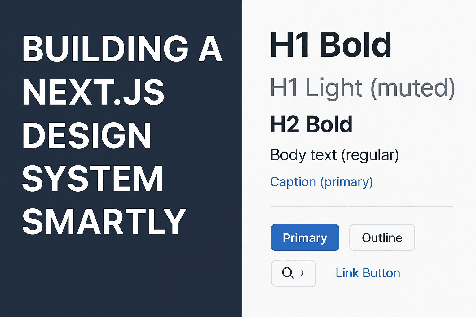
tsimport { cva } from 'class-variance-authority';

export const textVariants = cva('font-sans', {
  variants: {
    variant: {
      h1: 'text-5xl font-bold leading-tight',
      h1Light: 'text-5xl font-light leading-tight',
      h2: 'text-4xl font-bold leading-snug',
      body: 'text-base font-normal leading-relaxed',
      caption: 'text-sm font-medium leading-snug',
    },
    color: {
      default: 'text-black dark:text-white',
      muted: 'text-gray-500 dark:text-gray-400',
      primary: 'text-primary-500',
    },
  },
  defaultVariants: { variant: 'body', color: 'default' },
});
Create a Text component with semantic HTML:
tsimport { cva } from 'class-variance-authority';
import { cn } from '@/lib/utils';
import { textVariants } from './text-variants';

type VariantTagMap = {
  h1: 'h1';
  h1Light: 'h1';
  h2: 'h2';
  body: 'p';
  caption: 'span';
};

export type TextProps = React.HTMLAttributes<HTMLElement> & {
  as?: keyof VariantTagMap;
  variant?: keyof VariantTagMap;
  color?: 'default' | 'muted' | 'primary';
};

export function Text({ as, variant = 'body', color, className, ...props }: TextProps) {
  const Component = as || variant;
  return (
    <Component className={cn(textVariants({ variant, color }), className)} {...props} />
  );
}
Usage:
tsx<Text variant="h1">Big Bold Heading</Text>
<Text variant="h1Light" color="muted">Light H1</Text>
<Text variant="body">Standard Body Text</Text>
<Text as="span" variant="caption" color="primary">Primary Caption</Text>
This scales for responsive utilities (e.g., md:text-6xl) or truncation states. Integrate with libraries like shadcn/ui for pre-built components.
Crafting Versatile Buttons with CVA
Buttons require variations for style, size, or behavior. CVA ensures consistency by defining variants centrally. Define in src/components/ui/button-variants.ts:
tsimport { cva } from 'class-variance-authority';

export const buttonVariants = cva(
  'inline-flex items-center justify-center rounded-md font-medium transition-colors focus-visible:outline-none focus-visible:ring-2 focus-visible:ring-primary-500 disabled:opacity-50 disabled:cursor-not-allowed',
  {
    variants: {
      variant: {
        primary: 'bg-primary-600 text-white hover:bg-primary-700',
        outline: 'border border-gray-300 text-gray-800 hover:bg-gray-100 dark:border-gray-600 dark:text-gray-200 dark:hover:bg-gray-800',
        icon: 'p-2 bg-gray-100 text-gray-800 hover:bg-gray-200 dark:bg-gray-800 dark:text-gray-200 dark:hover:bg-gray-700',
      },
      size: {
        sm: 'px-3 py-1.5 text-sm',
        md: 'px-4 py-2 text-base',
        lg: 'px-6 py-3 text-lg',
      },
    },
    defaultVariants: { variant: 'primary', size: 'md' },
  }
);
The Button component handles polymorphism:
tsimport Link from 'next/link';
import { cn } from '@/lib/utils';
import { buttonVariants } from './button-variants';

export type ButtonProps = React.ButtonHTMLAttributes<HTMLButtonElement> & {
  variant?: 'primary' | 'outline' | 'icon';
  size?: 'sm' | 'md' | 'lg';
  asChild?: boolean;
  href?: string;
};

export function Button({ variant, size, asChild = false, href, className, ...props }: ButtonProps) {
  const Comp = asChild ? 'span' : href ? Link : 'button';
  return (
    <Comp
      href={href}
      className={cn(buttonVariants({ variant, size }), className)}
      {...props}
    />
  );
}
Examples:
tsx<Button variant="primary" onClick={() => alert('Clicked!')}>Primary Button</Button>
<Button variant="outline" href="/about">Outline Link</Button>
<Button variant="icon" size="sm" aria-label="Search">🔍</Button>
Accessibility features like focus-visible and disabled states are included. Test with Storybook or React Testing Library.
Integrating Fonts Seamlessly
Custom fonts enhance branding but require optimization. Use Next.js’s next/font:
tsximport { Montserrat } from 'next/font/google';

const montserrat = Montserrat({
  subsets: ['latin'],
  variable: '--font-montserrat',
  weight: ['300', '400', '500', '700'],
});

export default function RootLayout({ children }: { children: React.ReactNode }) {
  return (
    <html lang="en" className={montserrat.variable}>
      <body className="font-sans antialiased bg-white dark:bg-gray-900">
        {children}
      </body>
    </html>
  );
}
Update Tailwind config:
tsfontFamily: {
  sans: ['var(--font-montserrat)', 'system-ui', 'sans-serif'],
},
This preloads fonts and prevents layout shifts. Self-host for privacy or use display: 'swap' for faster renders.
The Value of This Foundation
Centralized design tokens ensure updates cascade, reducing bugs. CVA’s type-safe variants add composability, while Next.js and Tailwind optimize performance. Extend to theming, internationalization, or cross-platform tokens (e.g., Style Dictionary). Monitor with Lighthouse and axe for performance and accessibility.
This system enables fast iteration and consistent experiences, adaptable to evolving requirements.